Most Designers out there would probably have dabbled in freelance design work at some point, or you might even have the chance to work for an overseas client. The problem is: they might speak Chinese, which might not be your first language, or a language you’re fluent in. We’ve come up with a list of design terms and their chinese translations, in case you desparately need to know them for a meeting you’re about to have with a chinese client. If you aren’t a designer, stick around anyway to learn some new terms and their meanings 😉.
1. Golden Ratio
黄金比例 Huáng jīn bǐ lì
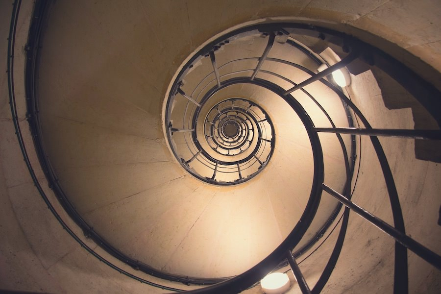 Image taken from: https://www.kimp.io/wp-content/uploads/2020/10/golden-ratio-in-spiral-staircases-EJJAKH5.jpg
If you aren’t a designer, or are one but haven’t heard of the golden ratio, also known as the golden section, is a special number approximately equal to 1.618 that appears many times in mathematics, geometry, art, architecture and other areas.
2. Rule of Thirds
三分法 Sān fēn fǎ
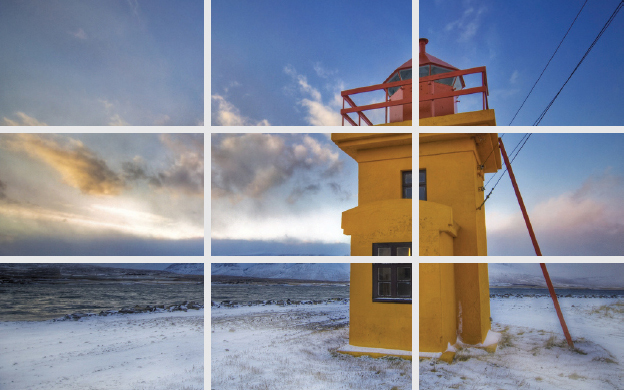
Image taken from http://web.cecs.pdx.edu/~fliu/project/thirdsrule/thirdsline.jpg
The rule of thirds is a composition guideline that helps draw the viewer's eye into the image and places more emphasis on the subject. This guideline that places your subject in the left or right third of an image, leaving the other two thirds more open.
3. Hierarchy
等级制度 děng jí zhì dù
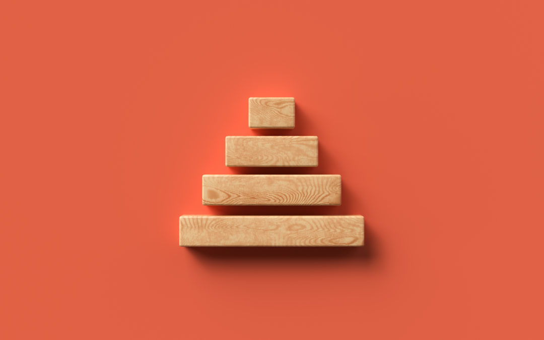
Image taken from: https://www.organimi.com/wp-content/uploads/2021/05/what-is-a-hierarchy-diagram-1080x675.jpeg
Hierarchy refers to the control of visual information in an arrangement or presentation to imply importance. It influences the flow and order of information that we see in a design. Hierarchy helps to provide structure and visual organisation in a design, as well as create focal points and ease navigation of a design for viewers. Hierarchy can be achieved through creating contrast through the other design principles, such as a difference in scale of objects, or with colour and white space, etc.
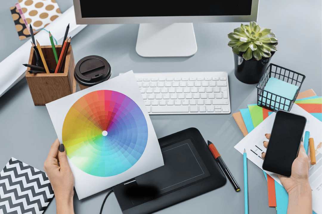
4. Complementary Colours
互补色 hù bǔ sè
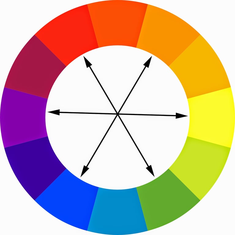
Complementary colour schemes draw on 2 opposing colours on the colour wheel, resulting in a high contrast combination, such as yellow and violet, magenta and green, and blue and orange.
5. Analogous Colours
类似颜色 Lèi sì yán sè
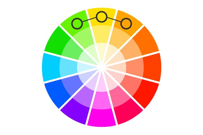
Analogous colours are a group of 3 colours side by side on the colour wheel. They create a visually pleasing and calming display, but provide a low contrast experience.
6. Gradient
渐变色 jiàn biàn sè
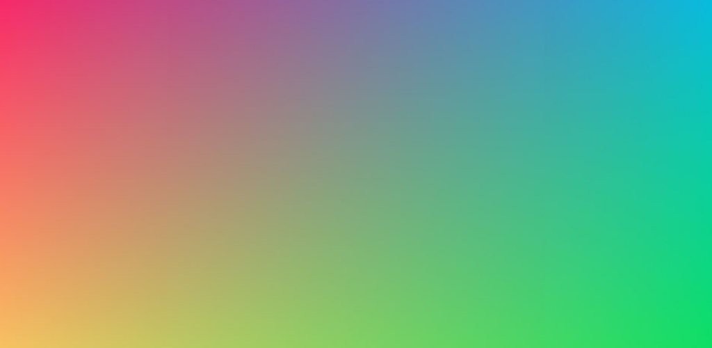
Gradients are colour transitions blending from one colour to another. They’re great for adding depth and colour to a design, and can consist of similar colours or even contrasting colours.
7. Alignment
对齐 duì qí
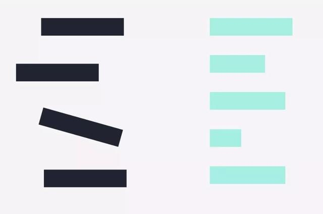
Image taken from: https://www.fotor.com/blog/wp-content/uploads/2019/01/8003ce1d7c0041cb931500075b214b6e-1.jpeg
You probably most commonly come across alignment when dealing with text - whether to align your paragraphs left, right or centered. Other elements in your design can also have alignment, and is crucial to keeping your design organised and flowing well.